
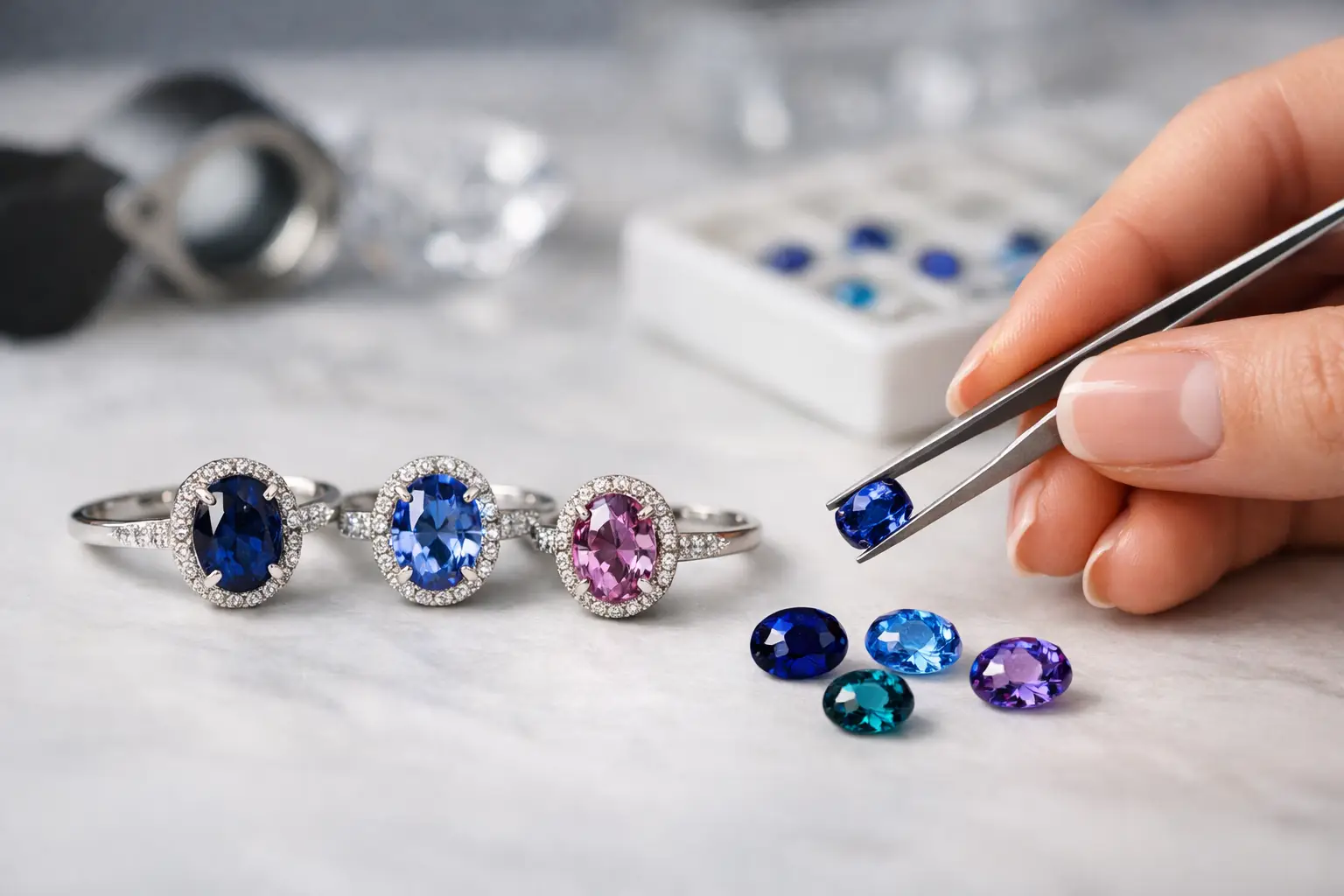
A sapphire can look unmistakably blue in one hand and quietly violet, inky, or gray-blue in another. That is why knowing how to select sapphire hue is less about naming a favorite color and more about learning to see the stone as it will live: in daylight, in the evening, and eventually in the jewelry you wear most.
For an engagement ring, an heirloom piece, or a loose gemstone chosen for a future design, hue is often the first quality that creates an emotional response. It should be. Yet a beautiful sapphire is never judged by hue alone. The most compelling stones bring hue, tone, saturation, cutting, and natural character into balance.
What sapphire hue actually means
Hue is the gemstone’s dominant spectral color: blue, pink, yellow, green, teal, violet, or a blend between them. A blue sapphire may carry a subtle violet modifier, for example, while a teal sapphire may sit closer to blue or green depending on its natural color balance.
Hue is different from tone and saturation. Tone describes how light or dark the sapphire appears, from very light to very dark. Saturation describes the purity and intensity of the color. A stone can be strongly saturated but too dark to show much life, or pale in tone yet exceptionally fresh and luminous.
This distinction matters because shoppers often ask for a “deep blue” sapphire when what they truly want is a vivid blue that remains visible. A sapphire that is overly dark may appear nearly black in lower light, especially once set. Conversely, a pale stone may look delicate and refined, but may not deliver the visual presence some buyers expect from a center stone.
Start with the feeling you want the stone to hold
There is no single best sapphire hue. The right choice depends on the person, the setting, and the kind of beauty that will still feel true years from now.
Classic blue remains a natural choice for those drawn to traditional fine jewelry. Within blue, however, there is a wide range: bright medium blue, velvety royal blue, cornflower blue, slightly violet-blue, and softer steely or pastel blue. Natural Ceylon sapphires are especially appreciated for their brightness and open, lively color, though each stone must be considered individually.
Pink sapphires can range from barely blushed to vivid magenta-leaning pink. Softer pinks suit a restrained, romantic design, while more saturated pinks make a confident center stone. Yellow sapphires offer warmth without the expectedness of a diamond, from light lemon to rich golden yellow. Teal and green-blue sapphires appeal to those looking for something distinctly personal, with a color that shifts beautifully between sea-green and blue.
Padparadscha sapphires occupy their own rare space between pink and orange. Their finest examples carry a delicate balance rather than a hard split between the two colors. If this hue speaks to you, avoid relying on a name alone. Look for a stone whose color feels harmonious and natural to your eye.
How to select sapphire hue under real light
A sapphire should not be chosen from a single image or one lighting condition. Color is responsive. Daylight often reveals a stone’s clearest body color, while warm indoor lighting can bring out violet, gray, or brownish modifiers that were less apparent outside.
When viewing a sapphire in person, ask to see it near a window in indirect daylight, then in normal indoor light. Turn it gently rather than holding it perfectly still. Notice whether the hue remains appealing across the face of the stone and whether it continues to show color when tilted.
For remote selection, clear imagery and video under more than one lighting condition are valuable. A trustworthy description should identify the primary hue and any meaningful secondary color, rather than presenting every blue sapphire as the same idealized shade. Natural gemstones deserve that honesty.
It is also useful to look at the sapphire against neutral surroundings. Bright packaging, a colored tray, or a strongly colored garment can influence what the eye perceives. Give yourself a quiet visual frame before deciding.
Watch for gray, brown, and black appearance
Secondary colors are not automatically flaws. A hint of violet can enrich blue; a trace of green may give teal its individuality. But gray or brown modifiers can reduce apparent brightness, particularly when paired with a dark tone. Whether this is a concern depends on the stone and your preferences. Some collectors actively seek moody, silvery blue sapphires. Others want clean, open color with as little gray as possible.
Ask a simpler question than whether the stone is technically perfect: does its color look alive to you? A sapphire with a slightly unusual hue but excellent light return can be more captivating than a darker, more conventional stone.
Choose tone and saturation alongside hue
For many sapphire rings, medium to medium-dark tone offers the most versatile result. It gives the gemstone enough depth to feel substantial while preserving visible color in everyday conditions. This is a useful starting point, not a rule.
High saturation is often desirable, particularly in blue, pink, and yellow sapphires. Still, intense color should not come at the expense of brightness. When saturation and darkness combine too strongly, the center of the stone may look extinguished, meaning areas appear black instead of reflecting light.
Paler sapphires deserve thoughtful consideration. A light blue Ceylon sapphire can have an airy, elegant quality that a darker stone cannot replicate. In a larger size or an open, light-filled setting, it may be exactly right. The trade-off is that pale color can look more subtle from a distance and may be influenced more noticeably by the metal beneath it.
Consider the cut before committing to a color
Cut does not change a sapphire’s natural hue, but it changes how clearly you see it. A well-cut stone can distribute color attractively and return light across its surface. A poorly proportioned stone may show a window, where the center looks watery or transparent, or dark areas that conceal the hue you paid for.
Look at the gemstone face-up, because that is how it will be seen once worn. The color should feel reasonably even, allowing for the natural variations that make each sapphire individual. Some zoning is common in natural sapphires and can be charming when subtle. Strong zoning that creates obvious pale or dark bands may be distracting, especially in a center stone.
Shape also affects perception. Oval and cushion cuts often deepen color visually, while elongated cuts can reveal more variation across the stone. A round sapphire may appear particularly even, though the best shape is ultimately the one that suits both the rough material and the intended design.
Match the hue to the metal and setting
The metal around a sapphire changes the way its color reads. White gold and platinum generally preserve a cooler, crisper impression, making them natural partners for blue, teal, violet, and many pink sapphires. Yellow gold can add warmth, which is beautiful with yellow, green, and peach-toned stones, but may make a pale blue sapphire seem slightly warmer by contrast.
Rose gold brings out warmth in pink, peach, and padparadscha sapphires. It can create an especially soft result, though it may be less suitable if you want a blue sapphire to appear icy or sharply cool.
Halo stones, side diamonds, and colored accents deserve equal attention. Bright white diamonds can make a pale sapphire appear gentler by comparison, while a saturated sapphire may hold its own beautifully. If the ring will include side stones, view the sapphire beside them before making the final choice.
Natural origin and treatment belong in the conversation
A sapphire’s hue is visually immediate, but its story matters too. Sri Lanka has long been known for sapphires with luminous, finely balanced color, including blue, pink, yellow, teal, and padparadscha varieties. Origin can add context, rarity, and provenance, but it should not replace careful assessment of the individual gem.
Treatment status is equally relevant. Heating is a long-established and accepted practice in the sapphire trade when disclosed, and it can improve color or clarity. Unheated sapphires are rarer and may carry a significant premium when their quality is strong. Neither choice is universally better. The meaningful question is whether the treatment status is clear, reflected fairly in the price, and aligned with what you value.
At Ceyloe, this conversation begins with the individual stone: its natural color, origin, treatment status, and the qualities that make it worth considering for a personal piece.
Give yourself permission to choose the less expected hue
The most enduring sapphire choice is rarely the one that matched a photograph perfectly. It is the stone that still draws your eye after you have compared it with others, seen it in ordinary light, and imagined it as part of your daily life.
If you return to a misty blue rather than the darkest royal blue, or to a green-blue sapphire instead of a classic navy, trust that response. A fine sapphire does not need to fit someone else’s definition of the ideal hue. It needs to feel unmistakably yours.
